


Photos courtesy of Wix.com
Welcome! This is a part of the
website where I show a bit
more personal expression of
what I'm passionate about.
Below you'll see where I
like to find inspiration
whether it be in national
parks or cartography blogs!
BUY
NOW
Earth is so cool.
Like, super cool. Mapping the earth, its processes, our people, and everything in between is what gets me up in the morning; it's what I stay up late at night googling and what drives my passion to learn more about the earth.Below you'll find out why I'm partial to it, and also some places where you too might find inspiration about why cartography is such a fun tool of expression + visual communication! Throughout my undergraduate studies, I've compiled an ongoing list of websites, handy cartography tools, articles, blogs, and interactive maps that I've come to love and reference for inspiration in and out of school. These can be found further down this page, along with some of my own additions as well.
Pictures taken in Arches National Park, March 2018
Edited using PowerPoint
Earth processes are one of my favorite things in the whole world (heh, pun intended). I've tried my best to learn as much as I can in school in related subjects like geology, earth resources, and especially geomorphology, my personal favorite. But there's nothing like going out and experiencing nature in person. Visiting national parks has filled up most of my spring breaks, but no place has a more special place in my heart than Arches National Park. Some of my pictures are shown below, but they don't do it justice. Whether I was on my campsite or roaming the trails, it was like I was dropped in the middle of all the rocks in the world;
truly the best feeling. The only trip that rivals this one was exploring the Negev Desert
in south Israel, which might have been the best day in my life to date. If any of this
sounds cool to you too, check out some of the links I've provided to the right
and make some time to explore our how cool earth is.
Geology
ROCKS


The best rocks I've seen:
Cartography Sites
Neat websites I've found over time to help with and inspire map-making.
The Map Room
A blog about maps that covers everything from antique map collecting to geospatial technology.
Gretchen Peterson
By a great author and cartographer, "A Cartographer's Toolkit" might be my favorite blog yet.
GIS Lounge
A great resource for everything up-to-date in GIS and Cartography in one convenient place.
If those of us in the geographic information system (GIS) realm have disregarded design in the past, we are now coming to realize that the elegant display of geographic data is as important as the data itself.
-Gretchen Peterson
through my camera lense!
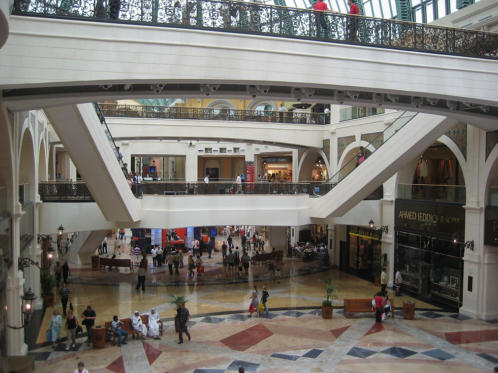
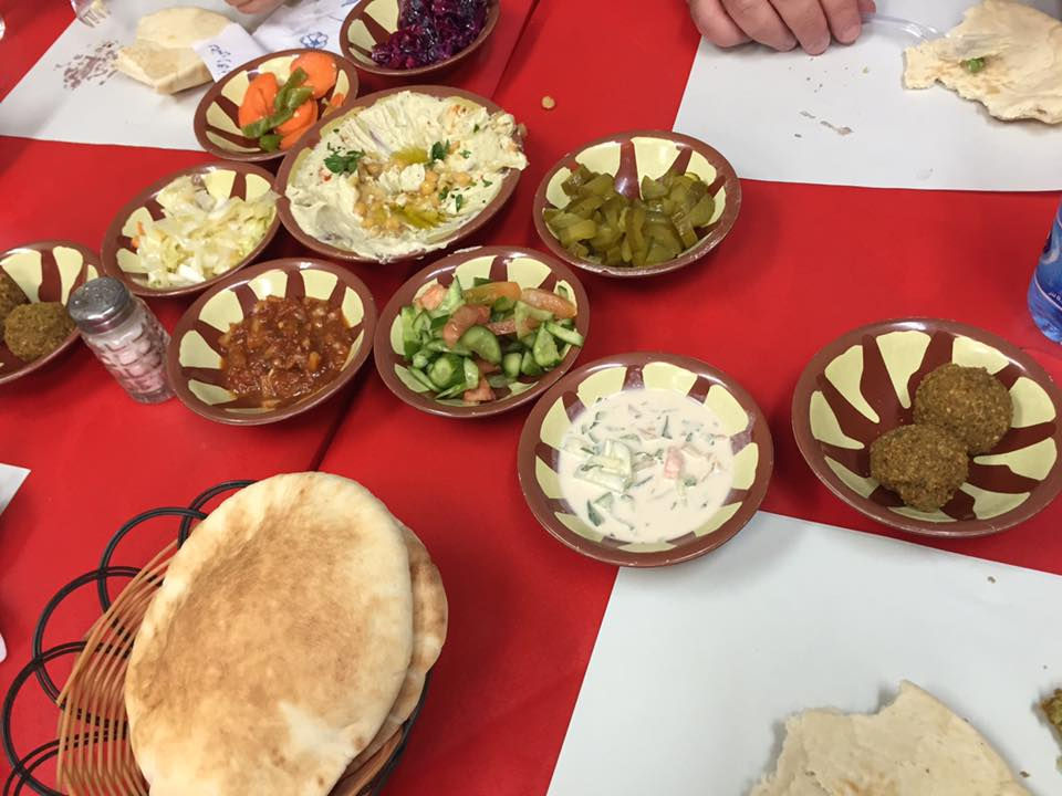
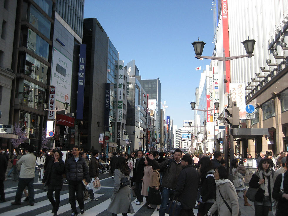
United Arab
Emirates


Israel


Thailand


Japan


Texas


a look at the
WORLD
Click each circle for more pictures!
Cartography Tools
Handy resources I've found over time to assist in the cartographic process.
D3.js
For the tech-savvy, D3.js is a JavaScript library for manipulating documents based on data.
ColorBrewer
Cynthia Brewer's tool helps to select good color schemes for maps and other graphics.
Carto
A platform to build powerful Location Intelligence apps. Make sure to sign up for 'Carto 5' emails!
MapBox
Mapbox is the location data platform for mobile and web applications. They have great basemaps!
FAVORITES

One of my favorite design aspects to experiment with in maps is the use of circles, as seen in the first 2 selections in my portfolio. While I was searching the web looking for maps to add to my inspiration folder, I came across this map and infographic from the NGA. These images are slides from Dr. Rachel Bernstein's presentation at Penn State's Arctic Symposium on October 20th, 2015.
Between the earthy tones and the clever use of transparency on this map, the color scheme is beautiful and draws attention to the center, while keeping the audience aware and interested on the contrastingly square inset maps. I personally love how clean and simple it is, while the aesthetics stay true to a colder color scheme, appropriate for the subject point.

Again, in this infographic from the Symposium, the use of circles is what initially caught my eye. At a closer look, I fell in love with the font choice and use of 3 simple colors for the main Ocean Floor map on the left; the use of sans-serif font flows with the overall rounded feel to the maps. I admire the daring choice of colors on the Zones and Submissions map in the top center, contrasting the lower two inset maps.
Showing change over time is always an exciting challenge in Cartography and GIS, and I love this models perspective of the dynamic sea ice extents from 1980 and into the future along the bottom here. The consistent outline with a shrinking point of focus is a beautiful visualization to convey the concept of melting.
The scales and legends are artfully placed, and have personally shown me yet another way data can be artfully displayed.
maps & infographics:
Cool Websites + Articles
An array of resources I've found over time that will catch the eye of any fellow nerd.
Mercator Projection
An interesting article in defense of the Mercator Projection. Interesting controversy!
Data Visualization
Visualization platforms from Randy Krum, an awesome data visualization and infographic designer.
Geography
An article on Geographic Awakening, and understanding the importance of Geography as a discipline.
Strange Maps
A wide collection of awesome maps from Big Think.
ThoughtCo. Maps
Navigate the world with these maps of cities, states, countries, and the world.
Spatial.ly
Written by a geography professor in London, here you'll find data and design.
Maps as Art
An article from GIS Lounge:
World Map as Seen Through
a Drop of Water.
Earth Systems
Visualizing earth systems with NASA to help identify relationships and make predictions.
Artful design shouldn't just be saved for maps, but used in everyday tasks as well! In this case, its class notes, essays, and exam outlines. Below are some highlights from my undergraduate course work in classes like History and Nature of Geography,
Geomorphology, Global Climatic Regions, and Advanced GIS.
ACADEMIA
School is cool.


Maps & Visualizations
A brief collection of visualizations worth sharing.
Mapping Meteors
Every meteorite-fall on earth
(kinda) mapped!
Interactive Terrain
A really cool active topographic map that you won't be able to take your eyes off of.
Strata Smith's Maps
Interactive maps from William 'Strata' Smith himself. Geology rocks.
Urban Layers
Explore the structure of Manhattan’s urban fabric through time with this cool experience with cartography.
Cable Map
A stunning example of cartography from TeleGeography: Submarine Cable History Map.
Geologic Maps
National Geologic Map Database by the USGS. A beautiful archive of geology + cartography.
Arctic Maps
An excerpt from Opt-N.net, these maps are true art and a great inspiration for circular themes.
Globemakers
Bellerby + Co. in London is creating high quality handmade terrestrial and celestial world globes.
The best of


The 5 Layers of Effective Map Design,
Layout, Font, Color, Features and Media, are just a hint of the insight that Gretchen Peterson discusses in her book, "GIS Cartography: A Guide to Effective Map Design." These 5 aspects are key elements in map design, which as Ms. Peterson would say, "is as important as the data itself." GIS is all about layers (of data). As ESRI puts it, "a layer represents geographic data, such as a particular theme of data. Examples of map layers include streams and lakes, terrain, roads, political boundaries, etc." To the right is a handy visualization I found of this concept.
GIS
GIS to me is a means of communication;
a spatial approach to problem solving by visualizing concepts and designing simple and original ways to understand the evolving world around us, especially through cartography. I believe that maps facilitate connection between data and information through innovative and artistic design!

The GIST Body Of Knowledge is a reference document created by the University Consortium for Geographic Information Science with the purpose to "create a comprehensive outline of the concepts and skills unique to the geospatial realm." I personally loving expanding my knowledge in the Cartography and Visualization sector, as well as the Design Aspects, but as a GIS student, learning a bit in each of the 5 sections this document suggests is wonderful for a well-rounded perspective on GIS.