
TEXAS TORNADOS
IN
Israel
Map Credit: esri ArcGIS online
IPRED Conference 2018
International Conference on Preparedness and Response to Emergencies & Disasters


Presentation Slides
 |  |  |
|---|---|---|
 |  |  |
 |  |  |
 |  |  |

The above video is a shortened version (made up of clips) of my 10 minute presentation on Morbidity and Mortality of Texas Tornado Outbreaks.

Presentation Recording
Jan.16,2018
Tel Aviv,
Israel
Check out what the presentation room looked like! Click to expand.
VISUALIZING the CLASSIFICATIONS
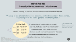
A problem I came across while preparing my presentation was verbally explaining the classifications I created for the different control groups in my research. As seen on the right (and on slide 8 in the presentation slides above), I created symbols for each of the 4 categories of tornado groups that I compared. Though this still takes a little bit of explaining (which can be found in the presentation recording above), this creative and simple visualization is more intuitive and efficiently understood.


Published Abstract
To the left is an image of the abstract that was published in IPRED V's Abstract eBook found here on page 185.
Below are the co-authors that assisted in this research during the CyberHeathGIS program.
Associate Professor
Department of Geography
Professor
Department of Computer Science & Engineering
Professor
Department of Geography
Department Head/Associate Professor
Department of Epidemiology and Biostatistics